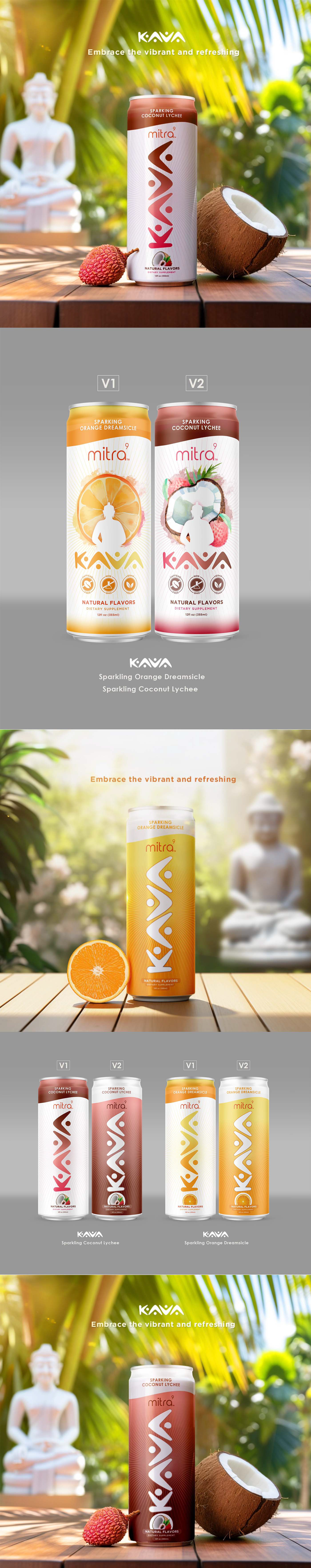
For Mitra9's Kava redesign, we zeroed in on what makes kava special: its natural calm and cultural roots. The goal was to strip away any clutter, leaving us with a clean, modern look that speaks directly to those seeking peace in their busy lives. We wanted the packaging to whisper tranquility and well-being, to stand out as a beacon for those looking to replace their evening drink with something more grounded and guilt-free.
This wasn't just about making things look pretty; it was about telling a story. Every element of the design was chosen to reflect the serene, mood-enhancing qualities of kava. From the soothing color palette to the minimalist layout, everything is designed to feel like a breath of fresh air. We're not just selling a beverage; we're offering an invitation to tranquility, a way to tap into the ancient wisdom of Southeast Asia's hillsides, all while keeping it sleek and contemporary for today's wellness-focused consumer.