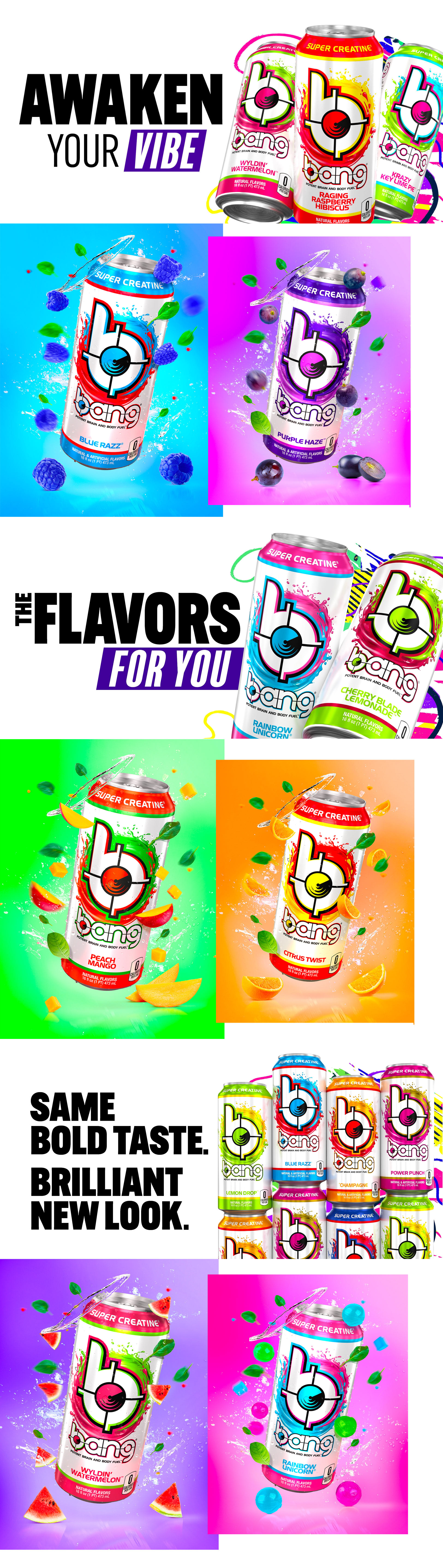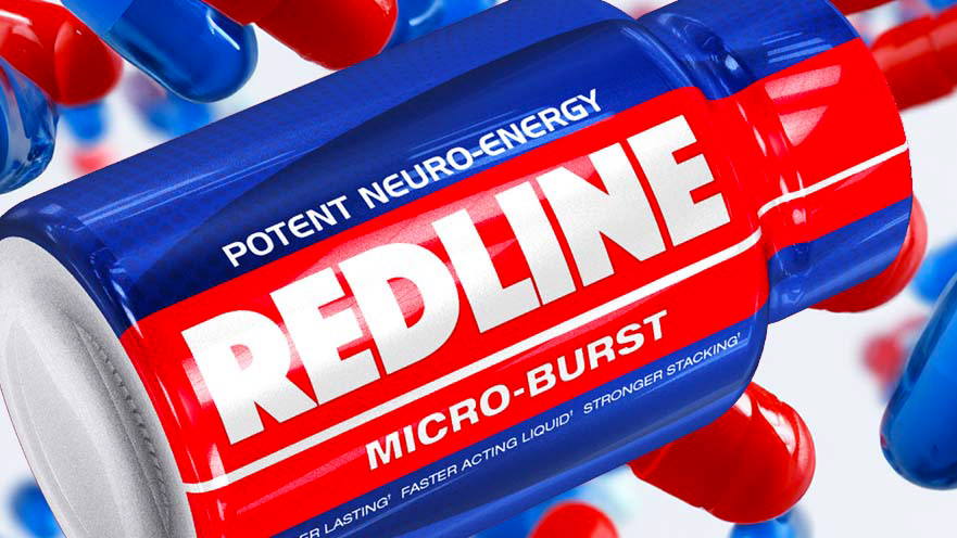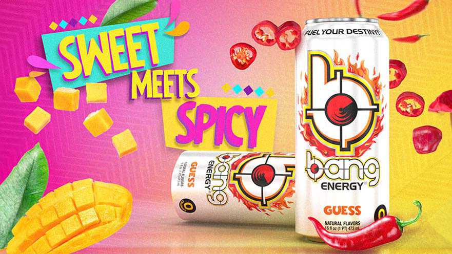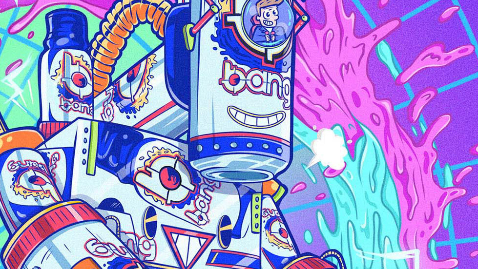
In my role as Creative Director for BANG® Energy, I spearheaded a transformative journey, shifting our energy drink cans from a blend of inconsistent and dark designs to a vibrant, unified aesthetic. Working closely with the CEO, we recognized the need to stand out in a market saturated with similar themes. Our vision? To break free from the industry-standard black cans and introduce a fresh, white canvas adorned with colorful stripes, differentiating each BANG® flavor in a visually appealing and meaningful way.
This initiative was a collaborative endeavor, with my dedicated team of designers bringing our collective vision to life. Together, we navigated the complexities of design and marketing, ensuring that our new packaging would not only set BANG® apart but also pioneer a new trend in the energy drink sector, moving away from the darkness and into the light of color and creativity.
Our efforts culminated in a bold, market-leading redesign that not only elevated BANG®'s presence but also redefined industry standards. This project underscores my commitment to leading with innovation, fostering teamwork, and executing strategic design transformations that drive brand growth and captivate consumers.