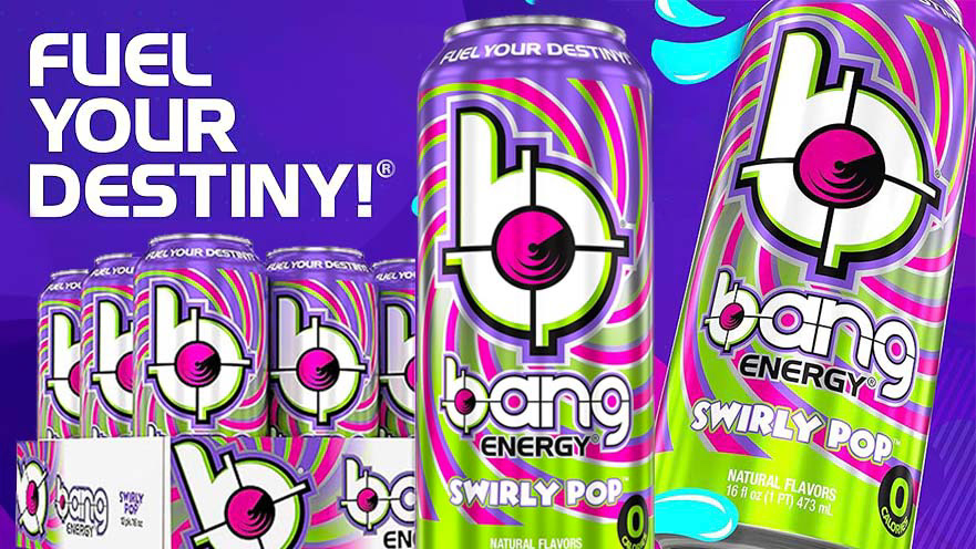
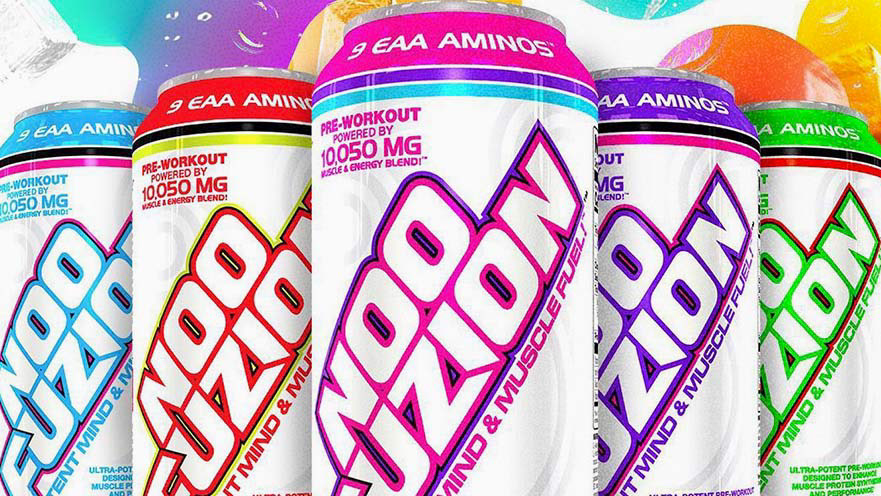
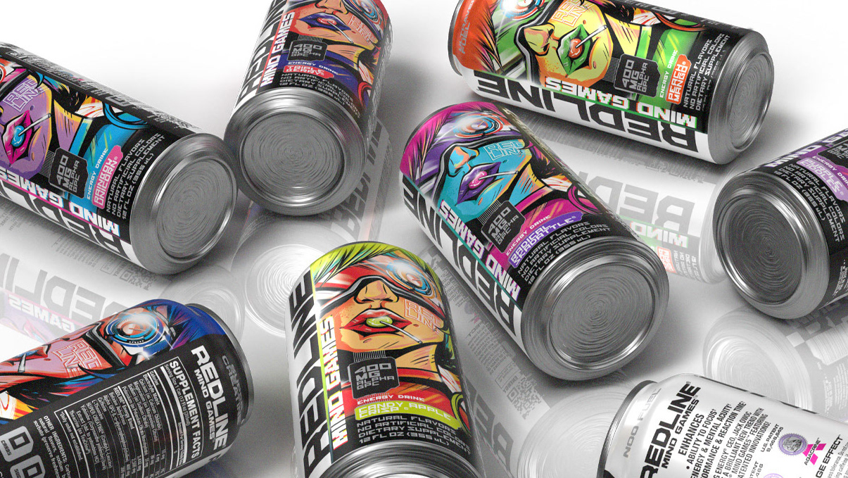
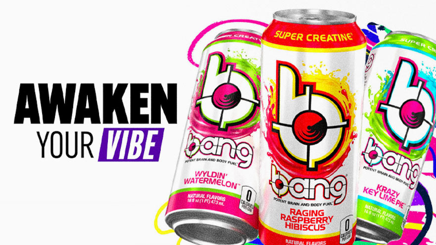
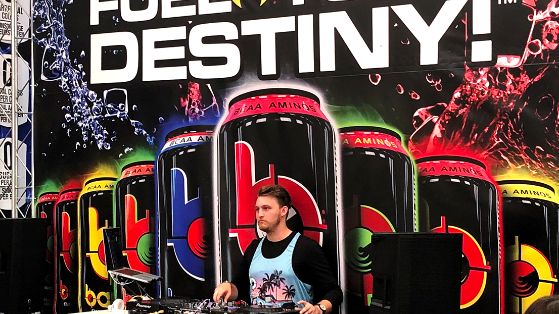
For the Mango Picante launch under Bang Energy, we ventured beyond the usual, fusing the fiery essence of picante with the vibrant soul of mango. The campaign, mysteriously named "GUESS," was a teaser, cloaking the actual flavor in intrigue while showcasing a redesigned can that hinted at the heat within. My role involved a crucial pivot in design: replacing the iconic element behind the Bang logo with a vector flame—a nod to the spice that sets this flavor apart.
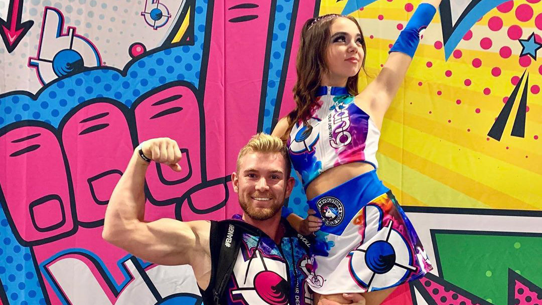
This wasn't just about adding heat; it was about celebrating the zest of Mexican traditions and the tang of Tajin, steering clear of the predictable color palette of reds, yellows, and oranges. Instead, we embraced a neon fiesta of purples, magentas, and yellows, infusing the campaign with an electric, modern vibrancy that screams fun and aligns perfectly with our brand's dynamic ethos. The creation of Mango Picante was a symphony of collaboration, blending the talents of our illustrator/designer, the packaging team, and the advertising crew—all harmonized under my direction. Together, we crafted a campaign that was ready to ignite the market with its bold design and tantalizing promise, embodying a fiesta in a can.
